What is Responsive Website Design?
In the “old days,” programmers didn’t use responsive web design to create a user-friendly experience for their website. Instead, companies would regularly manage an entirely separate website that received traffic forwarded based on the user-agent. This was a time-consuming effort that created more links that could be broken when connecting to a website. Nowadays, responsive website design has streamlined this process, using the same HTML code sent to all devices. Instead of traffic being forwarded, CSS is used when rendering the page on a user’s device.
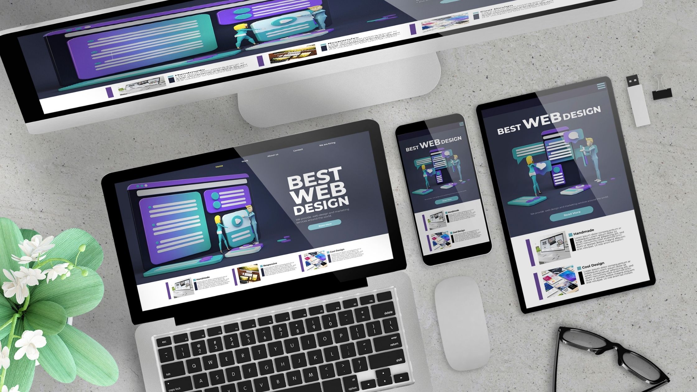
A term you may have only recently heard about, responsive web design is an approach that focuses on a website user’s environment, which depends on what types of device they are using during their web experience. Network connection, type of user interaction such as trackpads, touch screen, digital pens, screen size, and graphic resolution are all technical variables that define a user’s website experience. Responsive website design takes into account these components using CSS to create a more seamless user experience by creating readable text without requiring zoom, adequate space for tap targets, and negating the need for horizontal scrolling.

Why is Responsive Website Design Important?
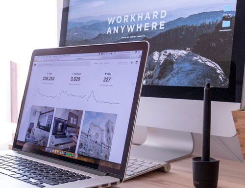
Responsive website design offers users an optimized browsing experience, meaning that your website will be easy to navigate, the buttons will work correctly and the screen will be correctly sized whether the user is looking at their laptop or mobile device, regardless of screen size.
When a potential client comes to your site, they are looking for a great experience. With responsive website design, you’ll have a layout that guarantees that no matter what type of device your customer is using, they’ll have the most consistent and best possible experience on your site. In addition, RWD ensures that users are seeing the most essential information from your website.
How Responsive Website Design Works
Non-fluid font and graphic sizes cause overlapping and can cut off text when resizing a website. Pages that aren’t fluid or have tables embedded can cause readability issues for screen readers. A one-size-fits-all approach to website design is not well-suited for those who need assistance reading internet sites.
Using multiple fluid grid layouts, responsive web design takes out the issues of a traditional adaptive design website by targeting the width of the user’s web browser to determine how much space is available and how the website page should be displayed with resolution breakpoints set up to target ranges that define specific types of displays.
Benefits to Using Responsive Design for Your Company Website
With over 60% of internet searches coming from mobile devices, you want to be ready for your customer to have a great experience they will want to return to again and again as 40% of users who have a poor website experience will migrate to your competitors’ website for a better user interface!
In addition to a great user experience, Google’s algorithm update will rank a responsive web design above an adaptive website when consumers use Google search. In effect, using RWD increases your visibility on search engines as Google prefers mobile-friendly websites over non-mobile-friendly sites.
Ready to rank on page one of Google and beat out your competition? To learn how you can get ahead of your competition with a responsive website design, contact us today for a complimentary consultation to see how Visual Web Group can get your social media platform going to start connecting with your customers today!